
Reassuring sections: removing doubt before payment
Before paying, buyers carry small questions: how do I pay? when does my access open? what if it is not for me? These sections answer with what the system really does: answers, steps and guarantee are read from your offer’s settings and update by themselves, and the deadline is only ever a date when the server really closes sales. Everything works for every workspace, and the launch price and the seats in “Deadline and seats” come from your offer. Our examples: Hind, an English tutor, Walid, a web development trainer, and Rym, a photographer selling a presets pack.
- About 3 minutes per section
- 7 steps
Who can do it: Anyone allowed to edit showcases.
In 7 steps
- 1“Questions”: nine answers read from your offer and kept up to date, up to 10 of your own, in six layouts; and “Objections”: the visitor’s doubts in their words with your answer, in five layouts.
- 2“Pay and start”: the steps of each ready payment method, in six layouts.
- 3“Guarantee”: the refund policy’s text as shown at checkout, in six layouts.
- 4“Comparison”: on your own or with your offer, or between your options, with rows and cells, in six layouts; and “Is it for you?”: yes-or-no questions that tell the visitor whether the offer suits them, in five layouts.
Show all
- 5“Contact”: a quiet WhatsApp button with a ready message naming the offer and the page code, in six layouts; and “Support”: where buyers find help after buying, in five layouts.
- 6“Deadline and seats”: a real date when the server closes sales, with a countdown in the last 72 hours.
- 7“Sign-up form”: a waitlist, a free file, a free live session or a call-back request.
Before you start
- A showcase open in the editor. Add the section from “Add a section” and change its layout in the “Layout” tab.
- Ready payment methods in the payment settings, and a refund policy for “Guarantee”. “Pay and start” and “Guarantee” read from them.
- A WhatsApp number in the site settings, needed by “Contact” and by the “With contact” layout of “Questions”.
- For “Deadline and seats”: a sales end on your offer, or a scheduled upcoming live session.
- Step 1 of 7
“Questions”: answers that update themselves
Buyers find answers to their objections before paying, most of them written by the platform from your offer.
- Answers from your dataNine answers (payment, instalments, access, refund…) that update themselves and vanish when their data is missing.
- What you writeUp to 10 questions the platform cannot know, like “Is it suitable for beginners?”. Payment and access are never typed by hand.
- ObjectionsA sister section for the visitor’s doubts in their words and your answer, up to 6. A doubt with no answer never shows.
The 6 layouts
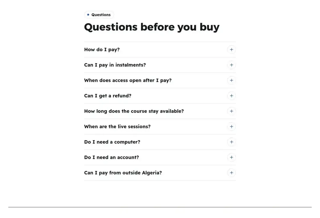
AccordionEach question opens its answer. TipWrite what the platform does not know: Hind adds “Is it suitable for beginners?” and “How many hours a week do I need?”, and leaves payment, access and refund to the automatic answers.
All the details
“Questions” answers the buyer’s objections before paying. It holds nine “Answers from your data” that the platform writes from your offer’s settings and keeps up to date; an answer disappears if its data is missing: “How do I pay?”, “Can I pay in instalments?”, “When does access open after I pay?” (at once by card, after receipt review with its measured time), “Can I get a refund?”, “How long does the course stay available?”, “When are the live sessions?”, “Do I need a computer?”, “Do I need an account?”, “Can I pay from outside Algeria?”. The answers say what really happens: a free course has no “How do I pay?”; a course that opens only with a card answers “With the card the teacher sells: you enter its code here and the course opens.”, and a longer list names “an activation card the teacher sells”; “Do I need an account?” answers “No. Your name and number are enough, and the course opens on this device.” when the order sheet sells the offer, and “Yes, you create your account before you start, and use it to reach your course from any device.” when payment happens on the checkout page; and “Do I need a computer?” says the academy installs on the phone like an app. Each has its own switch and the tag “Updates automatically”. You add up to 10 of “Your questions”: “Question”, “Answer” and “Group” (“Payment”, “Content”, “Access” or “Help”). The six layouts: “Accordion”, each question opens its answer; “Grouped”, the questions under the four group headings; “With contact”, the questions beside a “Didn't find your question?” card and an “Ask on WhatsApp” button; “Open”, a numbered list with every answer showing, in two columns on wide screens; “Cards”, a card per question that opens in place; and “Chat”, the questions as the visitor’s messages in button-coloured bubbles, the answers in your voice in card-coloured bubbles beside your face (the teacher’s photo, else the workspace logo, else the name’s initial), your name and “Questions students ask before joining” at the top, every answer showing with no folding; at the bottom, a “Didn't find your question? · Ask on WhatsApp” line only when a WhatsApp number is set in the site settings. The setting “First answer open” (all but “Open” and “Chat”) shows an answer without a tap. Beside it, the “Objections” section is not an FAQ: it holds your visitor’s doubts in their own words, and your answer in your own voice. You write “The doubts” (up to 6): “What the visitor says” (“I don’t have enough time.”) and “Your answer” (a few honest sentences, with no promise of results, timing or numbers), plus “Icon (cards)”. The section starts with four universal doubts and honest answers that you rewrite with the ones you really hear; practical questions (payment, access) stay in “Questions”. The five layouts: “Said and answered”, each doubt under “You might say” with your answer beside it, with your photo and name; “Cards”, a card per doubt with its icon, in two or three columns on desktop depending on how many doubts there are; “Myth and truth”, the doubt struck through under “People say”, then your answer under “The truth”; “List”, a calm numbered list; and “Spotlight”, the first doubt large on a dark panel with your answer, the others beside it. The setting “Face and name” for “Said and answered” and “Spotlight” (with no name, “The answer” shows instead), and ““You might say” before each doubt” for “Said and answered” and “Cards”.
On screenQuestionsAnswers from your dataYour questionsQuestionAnswerGroupAccordionGroupedWith contactOpenCardsChatFirst answer openUpdates automaticallyObjectionsThe doubtsWhat the visitor saysYour answerIcon (cards)Said and answeredMyth and truthListSpotlightFace and name“You might say” before each doubtHeads-upDo not type the payment, access or refund answer yourself: it comes from the offer, and when you change it at checkout it changes here. A section with no question at all does not show: “No questions yet: add one, or turn on an answer from your data.”. “With contact” needs a WhatsApp number in the site settings. “Objections” does not show without a doubt that has its answer: “Add at least one doubt with its answer to show this section.”, and a doubt with no answer is left out: “A doubt without an answer is not shown. Write your answer or remove it.”.
- Step 2 of 7
“Pay and start”: how the buyer pays and begins
Buyers know, step by step, how to pay and then start, for every method really ready in your offer.
- Which methods?By receipt, by card, on delivery and by activation code; only those the server accepts show.
- The account numberNever here: buyers only find it on the order page.
- “Instant” for whom?Card and activation code only. Do not promise instant access for receipts or cash on delivery.
The 6 layouts
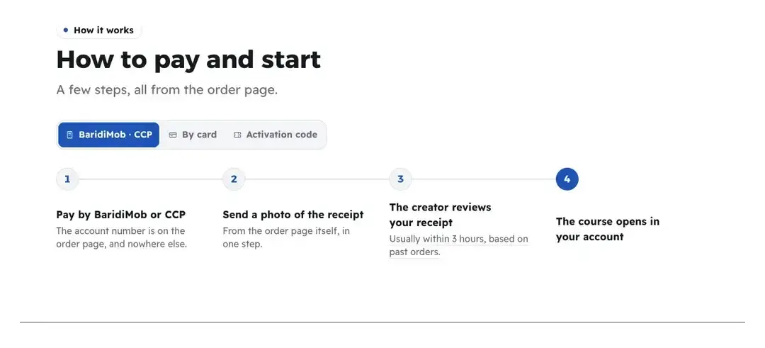
StepsA switch between methods, then their steps. TipWalid, a web development trainer, places “Payment methods” right after the price: three calm cards telling the buyer what happens after each method. To compare every method at a glance, choose “Table”.
All the details
“Pay and start” explains to the buyer how to pay and then begin, step by step for each method really ready on your offer, in words that suit what you sell (course, space, sessions, product). The four routes: “By receipt” (BaridiMob, CCP, transfer): pay then send a photo of the receipt, which the creator reviews; “By card”, payment is confirmed at once; “On delivery” (an activation card or a parcel paid on receipt); and “Activation code” from the creator. Only methods the server accepts appear, and never an account number: the buyer finds it on the order page only. The six layouts: “Steps”, a switch between routes (when there are several) and the numbered steps of each below; “Payment methods”, a card per method; “Trail”, the main route’s steps as nodes on a dashed line, with “Or pay:” and the other routes below; “Table”, every route in a table: “Payment method”, “How it works”, “Time”; “Numbers”, the main route’s steps as cards with large numerals; and “Payment cards”, one card per method the server accepts (BaridiMob and CCP transfer each get their own), with a small plate bearing the method’s letters (BM, CCP, CIB…) and a line on how it goes in the order page’s own words, then when access opens: “Instant” for card and activation code (“Confirmed at once” for a product that ships), “Once the receipt is checked” for receipts, “On delivery” for cash on delivery. In the “Time” column of “Table”: “Instant” for card and activation code only, “On delivery” for cash on delivery, and for receipts “Once the receipt is checked” or the measured review time. The setting “Review time” shows “Usually within 3 hours” when it is measured from your past orders.
On screenPay and startBy receiptBy cardOn deliveryActivation codeStepsPayment methodsTrailTableNumbersPayment cardsPayment methodHow it worksTimeReview timeHeads-upThe section needs a ready payment method and open sales: “No payment method is ready for this offer yet.” with “Set up payments”. And “Instant” only holds for card and activation code: do not promise instant access in your own texts for receipts or cash on delivery.
- Step 3 of 7
“Guarantee”: what you promise, as the buyer sees it at checkout
Visitors see your refund promise in the very words they will see at checkout and on their receipt.
- What you writeNothing: the days and the text come from the refund policy linked to the offer, and the section follows its changes.
- When does it show?When a refund policy is linked to the offer. Without one, the section hides.
- What you never write“100% guarantee” in any other text: the checker flags it.
The 6 layouts
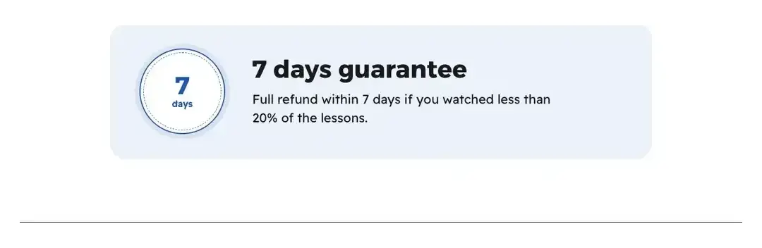
StatementA “7-day guarantee” heading, then the details. TipRym, who sells a digital photo presets pack, chooses “Question”: “And if the offer isn't right for you?” with the refund days as written in her policy below it. It is honest because it is exactly what the buyer sees at checkout.
All the details
“Guarantee” has nothing to write: the days and the text are read from the refund policy linked to your offer, in the same words the buyer sees at payment and on their receipt, so it is a commitment, not a slogan. With no policy the section does not show: “Shows only once a refund policy is linked to the offer.” with “Write the promise in the offer”. The six layouts: “Statement”, a heading “7 days guarantee” with the explanation below; “Line”, one small line “Refund possible within 7 days”; “Certificate”, a framed document with a “Money-back guarantee” stamp and “Committed by …”; “Numeral”, the number of days as a large outlined numeral with the rule beside it; “Question”, “And if the offer isn't right for you?” with the rule as its answer; and “Three reassurances”, three tiles that answer the last hesitations: the guarantee, lit, then “Pay the way that suits you” with the payment methods, then “A question before you buy?” with a link that opens WhatsApp. The payment tile shows only while the offer is open for sale, and the question tile only when a WhatsApp number is set in the site settings; otherwise the guarantee stands alone or with whichever is left.
On screenGuaranteeStatementLineCertificateNumeralQuestionThree reassurancesWrite the promise in the offerHeads-upDo not write “100% guarantee” in any other text: the checker flags it, and your real guarantee is what the refund policy says. If you change the policy, the section changes by itself.
- Step 4 of 7
“Comparison”: the difference, honestly
Visitors see the difference between learning alone and learning with your offer, or between your options, honestly.
- What you compareWays, not people: 2 to 3 columns, up to 10 rows, each cell “Yes”, “No” or a short value.
- “Is it for you?”A sister section: 3 to 5 yes-or-no questions, and the result links down to the offer, never a buy button.
- What you never writeNo competitor’s name, no “the best”. An empty cell shows “No”, so review every row before publishing.
The 6 layouts
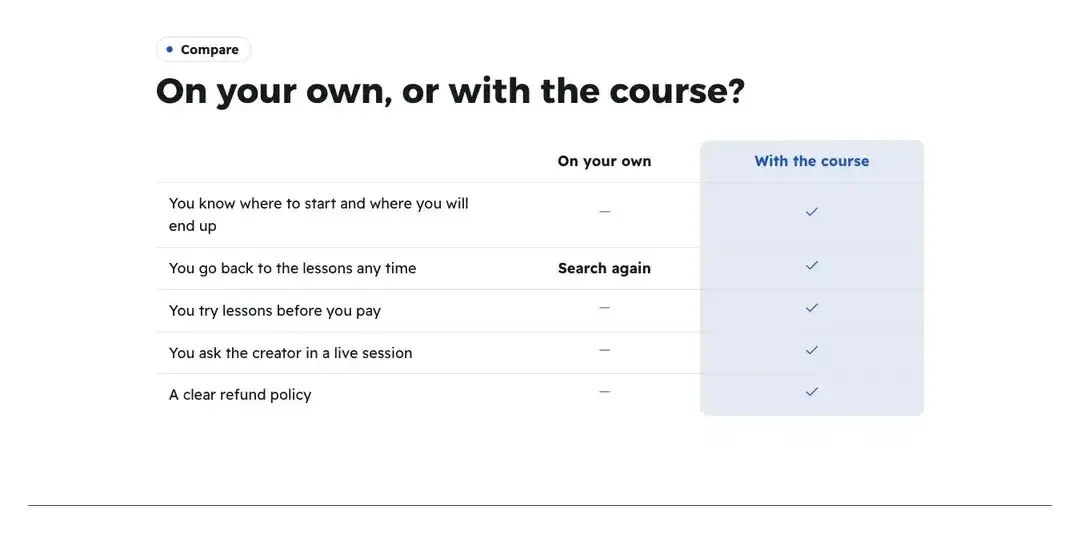
MatrixA table of columns and ticks. TipWalid compares “On your own” with “With the course” in four honest rows: “A clear path” no / yes, “Your questions get answered” no / yes, “Try lessons before you pay” no / yes, and for “Time” a short value “a year” against “10 weeks”.
All the details
“Comparison” compares approaches, not people: learning “On your own” versus with your offer, or between your own options. No platform or competitor names. You write the “Columns” (2 to 3): “Name” for each (“On your own”, “With the course”), then the “Rows” (up to 10): “What we compare” (“Try lessons before you pay”), and in each row “Cell 1”, “Cell 2”, “Cell 3” in column order: “Yes”, “No” or “Short value” (14 characters at most, typed in “Cell 1 value”), such as “Limited” against “Complete”. When you add the section, rows are suggested that the platform keeps only if your data proves them: “Try lessons before you pay” needs real free lessons, “Guarantee” needs a policy. The six layouts: “Matrix”, a table of columns and marks; “Versus”, a column per approach; “Scale”, the offer’s column as one large tinted card, the other approaches quieter beside it; “Rows”, a card per row with each column’s mark, made for phones; “Duel”, two approaches facing each other across an “or” badge; and “Tally”, each column’s score first (“5 of 5”, counted from the rows marked “Yes”), a bar to its measure, then its list; the offer’s column leads on a dark slab with its bar in the page’s colour, the others on a grey field with their own quiet bar. The setting “Highlight the last column” (“Yes” or “No”) for “Matrix”, “Rows” and “Versus”; “Scale”, “Duel” and “Tally” always raise one side, and in “Tally” it is the last column. For anyone asking “is this for me?”, the “Is it for you?” section: three to five short questions the visitor answers yes or no, right on the page. For each “Question” you pick “The answer that fits” (“Yes” or “No”), and you write “Result title: it fits”, “Result text: it fits”, “Result title: not now” and “Result text: not now”. It runs with no script at all: until every question is answered the visitor reads “Answer the questions to see whether this offer suits you.”; when all their answers are the fitting ones they see “This offer is for you” and a “See the offer” link down to the page’s offer section; otherwise “Maybe not right now” with a link to “Questions”, to “Contact” or to WhatsApp. It never sells by itself: no buy button, only a link further down the page. The five layouts: “Cards”, each question a card with two large answers; “List”, compact rows with a yes/no switch each; “One by one”, one question at a time with a progress bar, an answered question folding into a slim row that can still be changed; “Chat”, you ask in bubbles beside your face, the visitor taps a ready reply, and the result is the last bubble; and “Meter”, every fitting answer lights a segment of a meter on a dark panel, the verdict beneath it.
On screenComparisonColumnsNameRowsWhat we compareCell 1Cell 1 valueYesNoShort valueMatrixVersusScaleRowsDuelTallyHighlight the last columnIs it for you?QuestionThe answer that fitsResult title: it fitsResult text: it fitsResult title: not nowResult text: not nowSee the offerCardsListOne by oneChatMeterHeads-upThe section needs two rows and two columns: “Add at least two rows to compare.”. A row with incomplete cells is filled with “No” when shown, so review every row before publishing. Name no competitor and do not write “the best”. “Is it for you?” needs two questions to show: “Add at least two questions to show this section.”, and the editor reminds you that “At least three questions make the result fairer.”. With no offer section on the page: “The page has no offer section, so the “it fits” result shows without a link.”.
- Step 5 of 7
“Contact”: WhatsApp with a ready message
Anyone with a question before buying writes to you on WhatsApp with a ready message that names their page.
- The ready messageIt carries the offer’s name and the four-character page code, so you know where the request came from.
- What it needsA WhatsApp number in the site settings, or it hides. Fill in “Reply hours” only if you are sure of them.
- SupportA section for after the purchase: where buyers find help and who answers, up to 6 channels, with no reply time promised.
The 6 layouts
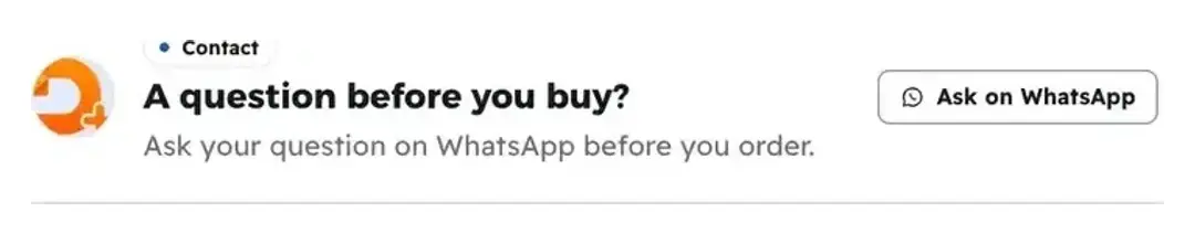
CardA card with a quiet WhatsApp button. TipRym puts “Line” right after “Questions”: whoever did not find their question taps and writes. When a message arrives with a “page code”, she knows which page the customer came from.
All the details
“Contact” is a quiet WhatsApp button for anyone with a question before buying. The “Ask on WhatsApp” button opens a chat with a ready message naming the offer and the four-character page code (“Hello, I have a question about “…” (page code L7K2)”), so you know which page a WhatsApp request came from. You write the “Heading”, “Intro” and “Reply hours” (“9:00 to 21:00”; empty, the line disappears), and turn on “Call button” to show the same number for a phone call. The six layouts: “Card”; “Chat”, the ready message as a draft bubble “Your message is ready; edit it as you like:”, so what you see is what gets sent; “Centred”, a centred card with a large face; “Slab”, a dark band with WhatsApp and the call side by side; “Line”, a single small line; and “Channels”, the heading and the “Reply hours” on one side and, on the other, a large tile for each real way to reach you: “WhatsApp” first and lit, with your number and the line “The chat opens with your message already written, naming the offer.”, then “Phone call” when “Call button” is on, then “Facebook” when your Facebook page is in the site settings; nothing else. After the purchase there is another section: “Support” tells buyers where to get help and who answers them. You write the “Support channels” (up to 6), each with an “Icon”, a “Channel name”, “How it works”, “When” and “At which stage” (“Before you start”, “During the lessons” or “After you finish”), then “Your promise”, one sentence in your voice signed with your name, and “Your role under your name”. “When” is yours to write: the draft never states a reply time, it says where the answer is found, not how fast it comes. The draft suggests “Under every lesson” and “After the last lesson”, “A WhatsApp line” only when a WhatsApp number is saved in your workspace, and “Questions in the live sessions” when your course is live or has live sessions. Who answers is the teacher (their photo and name), else the workspace (its logo and name). The five layouts: “Channels”, who answers beside the channel cards, each with a large icon and its “When”; “Timeline”, the help along the student’s path: before you start, during the lessons, after you finish; “Chat”, how to ask, with the question from “An example question” tagged “Example”, so it is not a real exchange, your answer from “Where the answer comes”, the channels after “Answers come in”, and a typing field that opens WhatsApp when the number exists; “Cards”, compact tiles two by two; and “Promise”, your face large and your signed promise on a soft field, the channels below. The setting “WhatsApp button” shows “Message on WhatsApp” only when a WhatsApp number is saved, and “Who answers” (your photo and name beside the channels) applies to “Channels”, “Timeline” and “Cards”.
On screenContactAsk on WhatsAppHeadingIntroReply hoursCall buttonCardChatCentredSlabLineChannelsWhatsAppPhone callFacebookSupportSupport channelsIconChannel nameHow it worksWhenAt which stageYour promiseYour role under your nameAn example questionWhere the answer comesTimelineCardsPromiseWhatsApp buttonWho answersHeads-upThe section needs a WhatsApp number in the site settings: “WhatsApp is not turned on in your site settings.” with “Turn on WhatsApp”. Fill in “Reply hours” only if you are sure: “We usually reply 9:00 to 21:00” is a promise the visitor reads. “Support” does not show without a channel: “Add at least one support channel to show this section.”, and a WhatsApp channel with no number is flagged: “One channel says WhatsApp, but no WhatsApp number is saved in your workspace. Add it or remove the channel.”. In “When”, never promise a reply time you do not keep.
- Step 6 of 7
“Deadline and seats”: a real date, never a fake timer
Visitors know when the price changes, when sales close or how many seats are left, and the server enforces it.
- Where does the date come from?End of the offer price, end of sales or the next live session. Seats come from your offer settings.
- When does it count down?In the last 72 hours only: days, hours and minutes, no seconds. At zero it never restarts.
- What you never writeNo “last chance” or “ends soon”, and no typed seat counts: the checker flags them.
The 6 layouts

RibbonOne sentence in a thin ribbon. TipHind schedules an opening live session for a new chapter and picks “Next live session” with “Countdown”: more than 72 hours before, the visitor reads “The live starts on …”, then sees days, hours and minutes.
All the details
“Deadline and seats” only shows a date when the server really closes sales, or real seats left, never a fake timer that resets. You pick “The date” from three sources: “End of the offer price” (the launch price), “End of sales” (your offer’s sales closing date) and “Next live session”; the page’s own end date does not count. The launch price and the seats come from your offer’s settings. You write the “Title” for “Seats”, “Countdown” and “Ticket”, and turn on “Seats left” (“7 seats left of 30”) and “Next price” (“… then 6,900 DZD” when a later price exists). Dates come from the server, not the visitor’s device. The six layouts: “Ribbon”, one sentence on a thin band; “Seats”, “7 seats left of 30” with a meter of the taken ones; “Countdown”, a date as a sentence, then only in the last 72 hours cells for days, hours and minutes, no seconds, minutes rounded up so “0” never shows before the end; “Calendar”, a tear-off calendar page for the real date; “Slab”, a dark slab with large countdown cells; and “Ticket”, an admission ticket: the date on a dark stub with two punched notches and a dashed tear line, then the title, the sentence (with the countdown in its last 72 hours, as elsewhere), the launch price’s cap line and the seats. “Ticket” needs a date: with seats only, the section shows as “Countdown”. At zero the countdown switches to its ended state (“Enrollment has closed. Refresh the page to see the current state.” for the sales end) and never restarts.
On screenDeadline and seatsThe dateEnd of the offer priceEnd of salesNext live sessionTitleSeats leftNext priceRibbonSeatsCountdownCalendarSlabTicketHeads-upWith no real date the section does not show: “This section only shows with a real date: a price ending, sales closing, an upcoming live, or limited seats.”. Do not write “last chance” or “ends soon” in any text: the checker flags them, and seats are not typed, they come from a real cap.
- Step 7 of 7
“Sign-up form”: a waitlist, a file or a free live session
Visitors sign up with their name and phone and get your file, their seat at the live or their place on the waitlist, with no payment.
- Which kind?“Waitlist”, “Notify on opening”, “Free file”, “Free live” or “Call me back”.
- The free fileUpload it and it reaches the sign-up through a private link that expires within minutes. With no file, the checker warns you.
- No paymentA free page never leads to a payment. The call-back window is read by the person signing up: choose what you can keep.
The 6 layouts
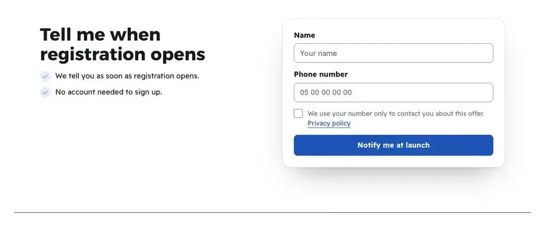
CardThe promise beside the form card. TipRym offers a “Free file”: a guide “5 product lighting mistakes”, and asks a single question “What kind of products?” to know her audience.
All the details
“Sign-up form” is a short form that becomes the page’s button on waitlist and free-file pages; it always asks for name and phone. You choose the “Form type”: “Waitlist”, “Notify on opening”, “Free file”, “Free live”, “Call me back”. You write “Heading”, “Intro”, “What they get” (up to 3 lines) and “Button label”, turn on “Email field” and “Wilaya field” if you want, and add “Your questions (up to 3)” (“Short text”, “Pick from a list”, “Yes or no”) and “Consent text” (the privacy policy link is added by itself). For “Free file” you upload the file with the “Upload the file” button the checker offers, and the person signing up gets it through a private link that expires within minutes; or you set “Outside link to the file (optional)” with “File name” and “File cover”. For “Call me back” choose “When you call back” (“today”, “within 24 hours”, “within two days”), because the person signing up reads it. The six layouts: “Card”, “Cover”, “Centred”, “Dark slab”, “Ticket”, and “With benefits”, what the person signing up gets on one side (“What signing up gets you”, with the cover above it when there is one) and the form on the other: the standard points of this form type, until you write your own in “What signing up gets them (up to 4)”.
On screenSign-up formForm typeWaitlistFree fileFree liveCall me backWhat they getButton labelEmail fieldWilaya fieldYour questions (up to 3)Consent textOutside link to the file (optional)When you call backCardCoverCentredDark slabTicketWith benefitsWhat signing up gets them (up to 4)Heads-upA “Free file” with no file is flagged: “A “free file” form with no file: upload it so it arrives right after sign-up.”. A free page never leads to a payment, and the call-back window is read by the person signing up: choose what you can keep.
After the reassuring sections
- Place the priceOne price section carries the page’s button, then “Final word”.
- Check on a phoneQuestions and the comparison are the longest on the page: check the phone-friendly layouts.
- Set up payments and refunds“Pay and start” and “Guarantee” read from there.
- See what visitors doIn the results: who reaches the order and who leaves before.
Questions
Why does “Pay and start” or “Guarantee” not show?
“Pay and start” waits for a ready payment method and open sales, “Guarantee” for a refund policy linked to the offer. The editor says what is missing, with a button to fix it.
Do I type the answer to “How do I pay?” myself?
No. The payment, instalments, access and refund answers are read from your offer and update by themselves, and disappear if their data is missing. You write the other questions, up to 10.
What does “Instant” mean in the “Pay and start” table?
Only card payment and activation code open at once. A receipt is “Once the receipt is checked”; cash on delivery is “On delivery”.
Can I name competing platforms in “Comparison”?
No. Compare approaches (on your own or with your offer) or your own options; the checker flags competitor names and “the best”.
Can I write “the offer ends tomorrow”?
Only with a real date when the server closes sales. “Deadline and seats” reads the end from your offer or your next live session, and the countdown only starts in the last 72 hours and never restarts.
Why no “launch price” or “seats”?
Because the showcase’s offer has no launch price and no seats: they come from the offer’s settings in “Offers”. “End of sales” and “Next live session” always work.
Do I need a WhatsApp number for “Contact”?
Yes, in the site settings. Without one the section does not show, nor does the “Ask on WhatsApp” button of the “With contact” layout of “Questions”.
What is the difference between “Questions”, “Objections” and “Is it for you?”?
“Questions” answers the practical side (payment, access, refunds). “Objections” sets out the visitor’s doubts in their words, with your answer. “Is it for you?” asks yes-or-no questions so the visitor knows whether the offer is for them, then points down to the offer; it never sells by itself.